Keeping Track of Users' Availability
ConnectWise | 3 min read | 2018
Note: The information in this project is my own and does not necessarily reflect the views of ConnectWise.
ConnectWise Manage is a core product of the ConnectWise suite used for things such as handling support tickets, project management, and time tracking. An initiative was in place to overhaul Manage's old mobile app and completely redesign it.
Goals
The primary goal for this project was to add a feature to the redesigned mobile app (for iOS and Android platforms) known as the In/Out Board. This feature allowed users to mark themselves as being in or out of the office so other team members could see their availability and was already on Manage's web version.
Users
ConnectWise's users are typically IT professionals in small to medium sized businesses. They provide IT services to their respective customers and use the ConnectWise suite daily to run their business. Examples of these IT services are consulting on hardware to buy and monitoring computer networks; essentially functioning as an in-house IT department.
My Role & Team
I was the main designer that delivered mockups. I collaborated with a product manager and another UX designer.
Design Tools
I used Sketch for the mockups and Zeplin for uploading final assets to developers.
Constraints
I had to meet a deadline of about 2 weeks.
Design Process
The project kicked off with the main product manager assigning a design task to me that listed the requirements in Jira. I also got together with the lead UX designer who designed all other mobile features to talk more about what needed to be done. The lead UX designer showed me a component library she built in Sketch that I would use for my designs.
Having a component library allowed me to jump from sketching straight into high-fidelity mockups; this sped up my workflow. Looking at the In/Out Board feature on the web version helped with understanding how the feature worked. I also had to ensure consistency across web and mobile, for example: providing the same choices, the same steps, etc. What also helped me in my design process was looking at outside products with similar functionality. Because I had experience with this functionality in other apps, I had some existing knowledge to draw from to serve as a starting point.
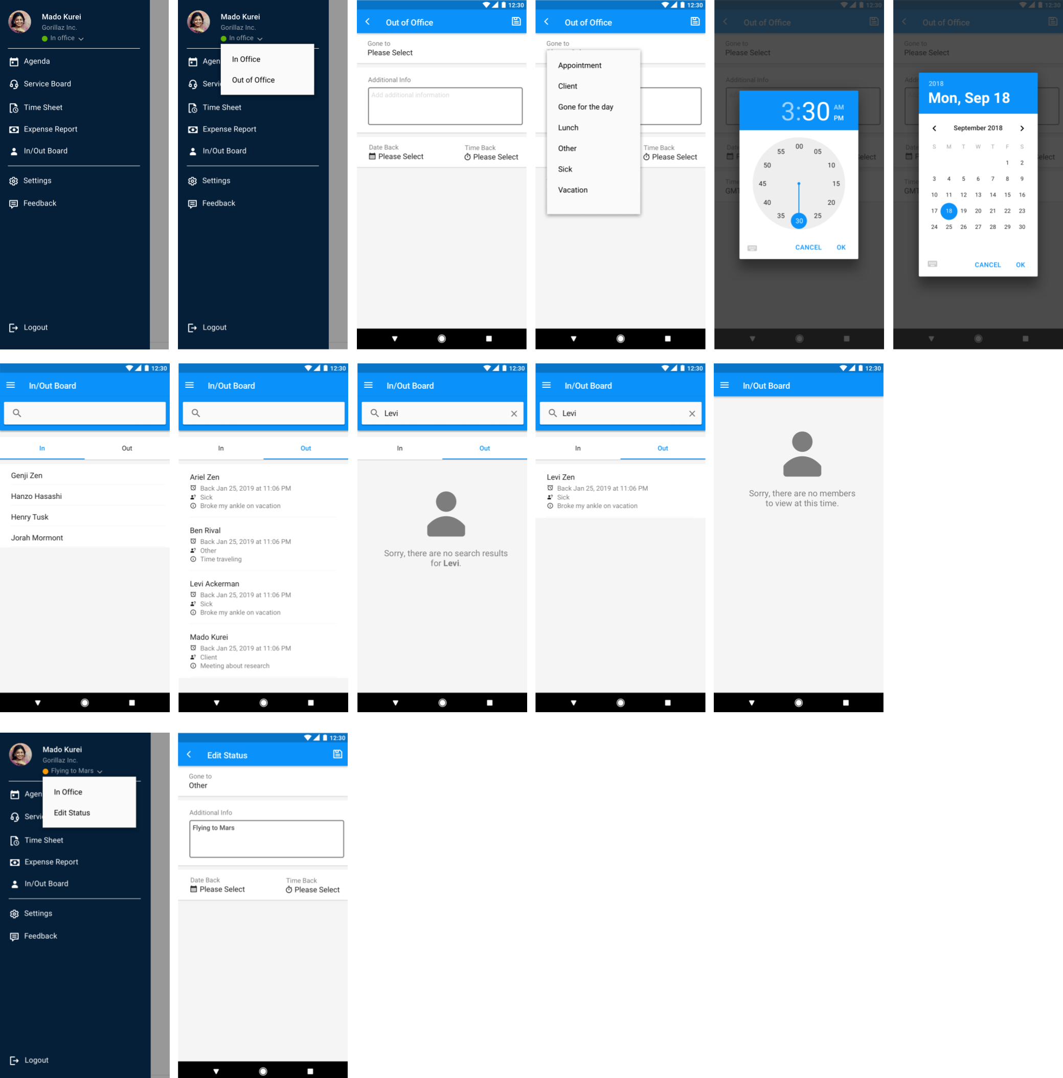
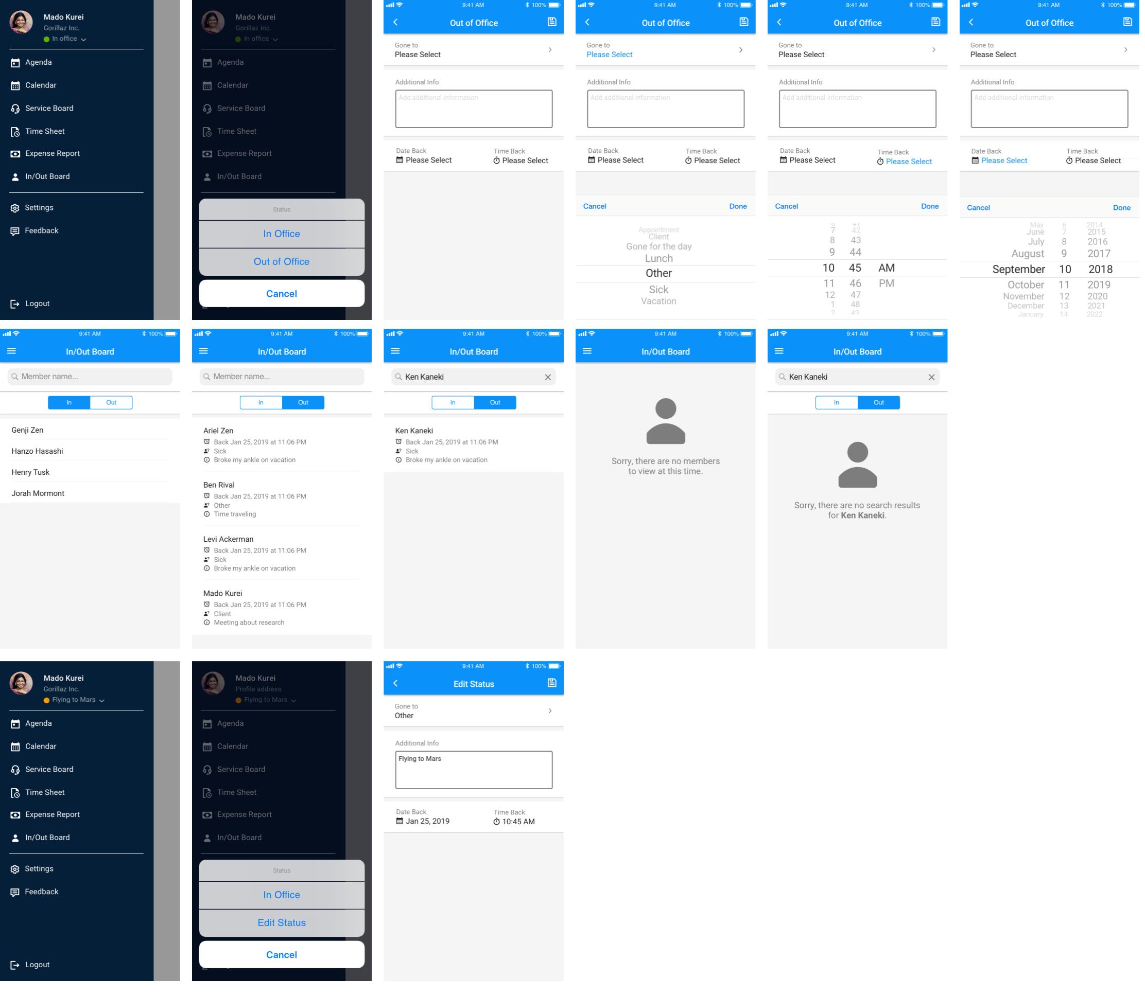
My designs had to show the following scenarios: users marking themselves as being in or out of the office, users being able to edit their status, and also having a place to see all team members' availability. Once I finished the designs, I sent them back to the lead designer to review. Once the lead designer gave her blessing, the product manager reviewed the designs and I uploaded them in Zeplin for the developers.
I only did mockups because the nature of the feature was not overly complex and didn't necessarily warrant a prototype for clarity. Also, my stakeholders' (the product manager and lead UX designer) way of reviewing all mobile designs was getting them uploaded as high-fidelity mockups in Zeplin and numbering them in order as a user flow. The designs went through 1 iteration. Because the feature's current usage was not high at the time, I was told not to worry about immediately conducting user testing.

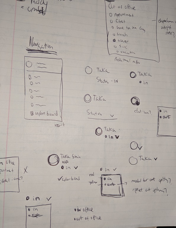
Some exploration sketches.

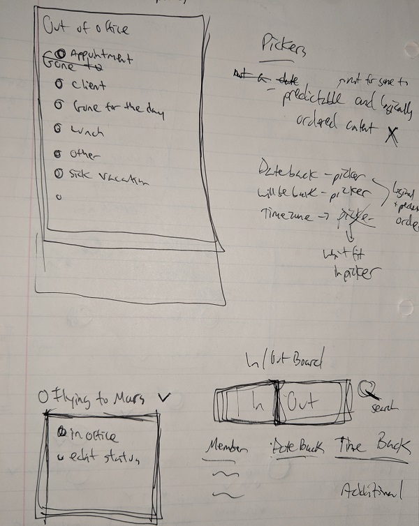
More exploration sketches.

High fidelity mockup - Android flow

High fidelity mockup - iOS flow
The Result
Stakeholders signed off on initial designs and were planning on when to build the feature.
Next Project